

Designing professional Case Competition PPTs is one of the most important aspects of cracking the case competitions. In a recent case competition, I had the opportunity to showcase my skills and creativity by designing a case deck for an Indian OTT (Over-The-Top) platform. Little did I know that this experience would turn out to be my worst-case competition encounter, but it also became the source of valuable lessons on how to design effective and visually appealing case decks. In this article, I will share my insights from this experience, highlighting the importance of design elements and adhering to specific guidelines.
**Case Deck Pdf in the end to download for free**
The Initial Design: Excel Dashboard and Financial Projections
During the case competition, my team and I dedicated countless hours to create an impressive case deck. We took pride in our financial projections and Excel dashboard, recognizing that these elements would be crucial in portraying the potential success of our proposed OTT platform. These components became the backbone of our presentation and were positioned as our main strength.
The Unexpected Setback: Questioning the Design Elements
However, as the presentation commenced, we were caught off guard when one of the judges interrupted us to question the design choices we had made. Specifically, they questioned why we had used italics and a black background, expressing their discontent with our design approach. This unexpected setback highlighted the significance of design in case decks and prompted us to reflect on our choices.
Embracing Constraints: The Key to Success
Rather than becoming disheartened by the judge’s interruption, we decided to transform this setback into an opportunity for growth. We realized that adhering to certain design constraints could help us create visually stunning and cohesive case decks.
Here are the constraints we discovered and incorporated into our subsequent designs, which significantly improved our presentations:
Standardized Fonts for Consistency
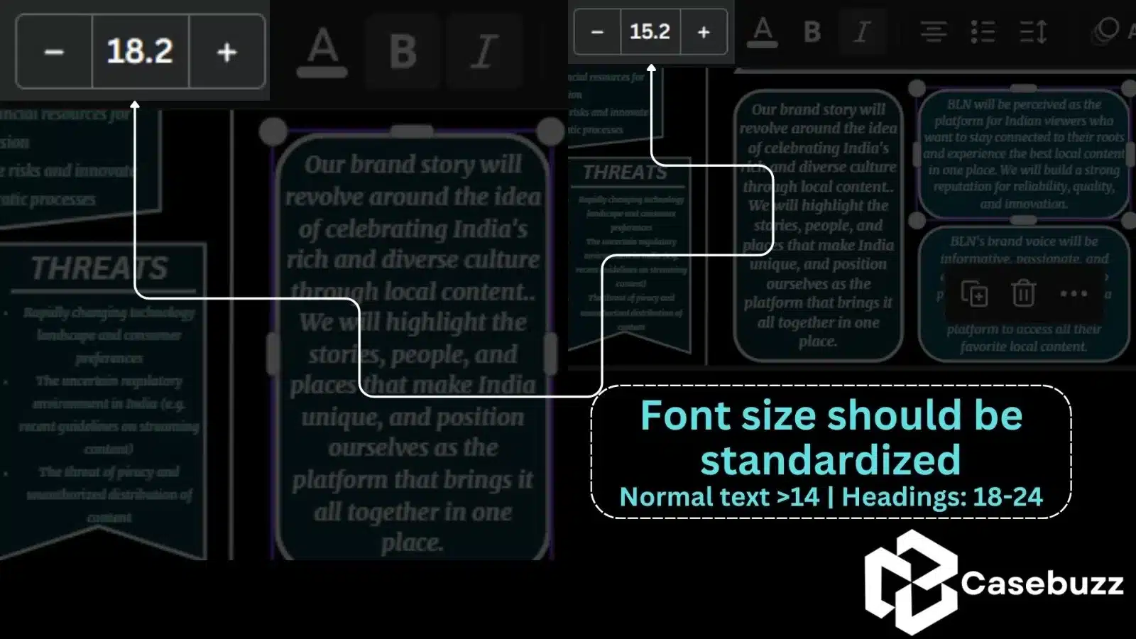
One of the crucial lessons we learned was the importance of using standardized fonts across all slides. Consistency in font choices for headings and text throughout the deck created a sense of cohesiveness and professionalism. By avoiding multiple fonts, we ensured that our audience could focus on the content rather than being distracted by constantly changing typography.
Strategic Use of Margins
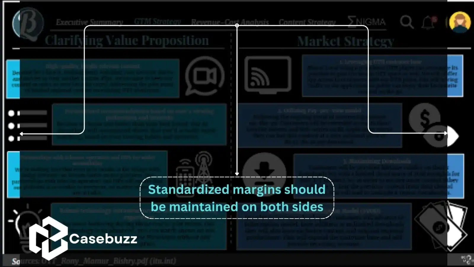
To enhance the visual appeal and clarity of our case deck, we started leaving margins at the top and bottom of each slide. This extra space allowed for an index ribbon, heading, and subheadings, which were essential for maintaining a coherent narrative. Additionally, the margins on the sides gave the entire deck a clean and organized look, ensuring that our audience could navigate through the slides seamlessly.
Avoiding Italic Text and Cramming Frameworks
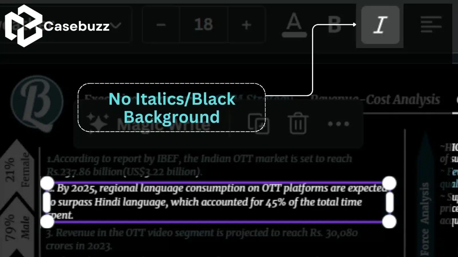
As advised by the judge during the competition, we made it a point to avoid using italics in our subsequent designs. This simple adjustment not only improved readability but also conveyed a sense of professionalism and adherence to design norms.
Furthermore, we learned the importance of dedicating each slide to exploring a single framework in depth, rather than cramming multiple frameworks into one slide. By focusing on one framework and finding meaningful inferences, we were able to articulate our ideas more effectively, showcasing our analytical prowess.
Reliable Sources and Assumptions
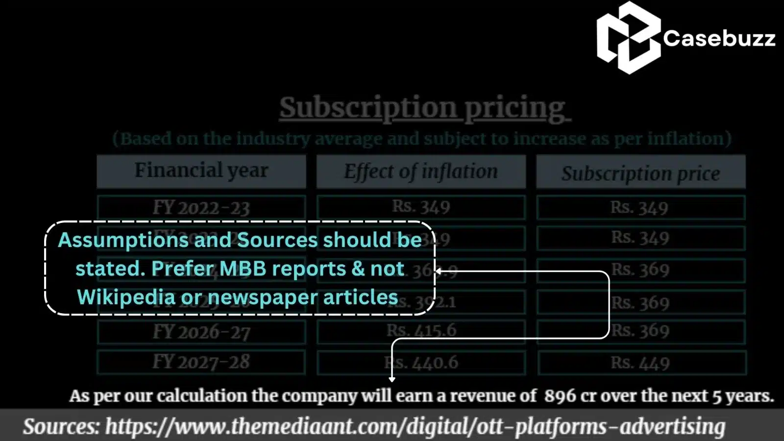
Our experience in the case competition allowed us to recognize the significance of thorough research and credible sources. We expanded our research beyond general platforms like Wikipedia and Investopedia, actively seeking reports and research papers from renowned consulting firms such as McKinsey, BCG, Bain, EY, PWC, and others. By incorporating these reliable sources in our appendix, we added credibility and depth to our case deck.
Additionally, we understood the importance of clearly stating our assumptions and ensuring they were reasonable. Transparency and clarity in stating assumptions allowed our audience to follow our thought process, creating a more compelling narrative.
Using Bold Sparingly
Another valuable lesson we learned was to use bold font sparingly. Placing emphasis on important points by bolding them allowed our audience to quickly identify key takeaways. However, we made sure not to overuse this formatting option, as excessive bolding can be visually overwhelming and diminish its impact.
Conclusion
In conclusion, my worst-case competition experience became a transformative learning opportunity that equipped us with invaluable insights on designing case competition ppts . By embracing the constraints identified through our setback, we honed our skills in creating visually appealing and impactful case competition ppts . From the standardization of fonts and strategic use of margins to avoiding cramming frameworks and incorporating reliable sources, we recognized the importance of attention to detail and thoughtful design choices.
The key takeaway from this experience is that design plays a significant role in making case competition ppts visually engaging and persuasive. By following these guidelines, aspiring case competitors can elevate their presentations, captivating their audience and maximizing their chances of success. So, don’t limit yourself to ordinary design methods; think outside the box, embrace creativity, and let your case deck stand out from the competition.
Remember, in the world of case competitions, designing professional case competition PPTs and adherence to the basic rules are the keys to acing that case competition!
You can download the case competition ppt from here!
Add a Comment